 Forge SPC GuidesForge SPC
I-MR chart walkthrough: injection-molded part weight
Goal
An injection molding machine makes one part per shot, and each part is weighed: 25.00 g, LSL 24.80, USL 25.20. There is no natural way to group shots into subgroups, so each weight is charted on its own. Thirty shots are available.
The questions are the usual two — is the process stable, and is it capable? — but with single measurements the answers depend heavily on which data the limits are computed from. This guide shows that on the I-MR example that ships with Forge SPC. Every number below is what the app shows.
The data
- Characteristic: part weight (g), one part per shot
- Measurements: 30 individuals (n = 1)
- Specification: LSL 24.80 · Target 25.00 · USL 25.20
- Story behind it: stable for shots 1–15, a shift upward for shots 16–24 (mold temperature), recovery, then a single heavy part at shot 28 that sits exactly on the USL
The data is synthetic and built to behave like that story.
Step 1 — Add the example project
Open Examples & Templates and choose Add as Project on I-MR Injection Molding.

The project opens on its chart page.
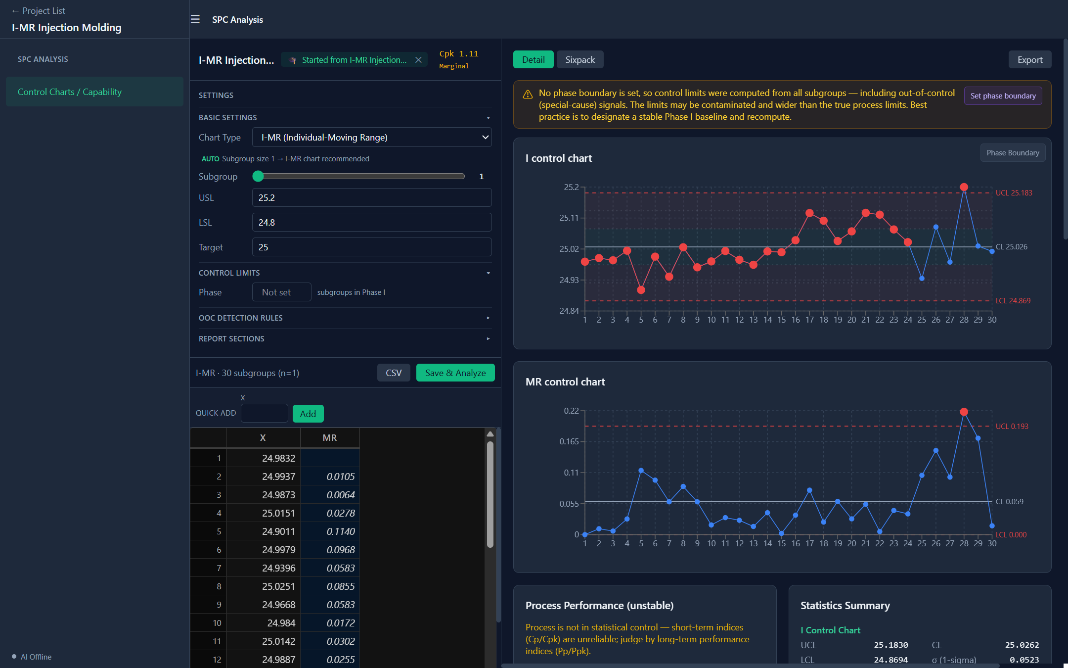
With one measurement per subgroup Forge selects I-MR (marked AUTO). The data table adds an MR column: each moving range is the absolute difference between a measurement and the one before it, which is how short-term variation is estimated when there are no subgroups — σ̂ = MR̄ / d₂, with d₂ = 1.128 for ranges of two consecutive points.
Step 2 — Look at the limits computed from everything
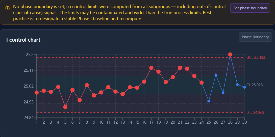
With no Phase boundary, all 30 measurements set the limits — I chart: UCL 25.183, CL 25.026, LCL 24.869 — and Forge warns that they may be contaminated.
Look at what the chart reports:
- Only shot 28 is beyond the I chart's limits (Nelson Rule 1), and its moving range is the one point beyond the MR chart's.
- Nelson Rule 2 covers shots 1–24: shots 1–15 all sit below the center line and 16–24 all sit above it.
That second signal is the tell. The shift from shot 16 pulled the center line up to 25.026, between the process's two levels, so the stable period now looks like a run below average and the shifted period like a run above. The shift itself is inside the limits: the limits were widened by the very shift they should be detecting.
Step 3 — Set a Phase I baseline
Shots 1–15 were made before the mold temperature changed. Under Control Limits → Phase enter 15.
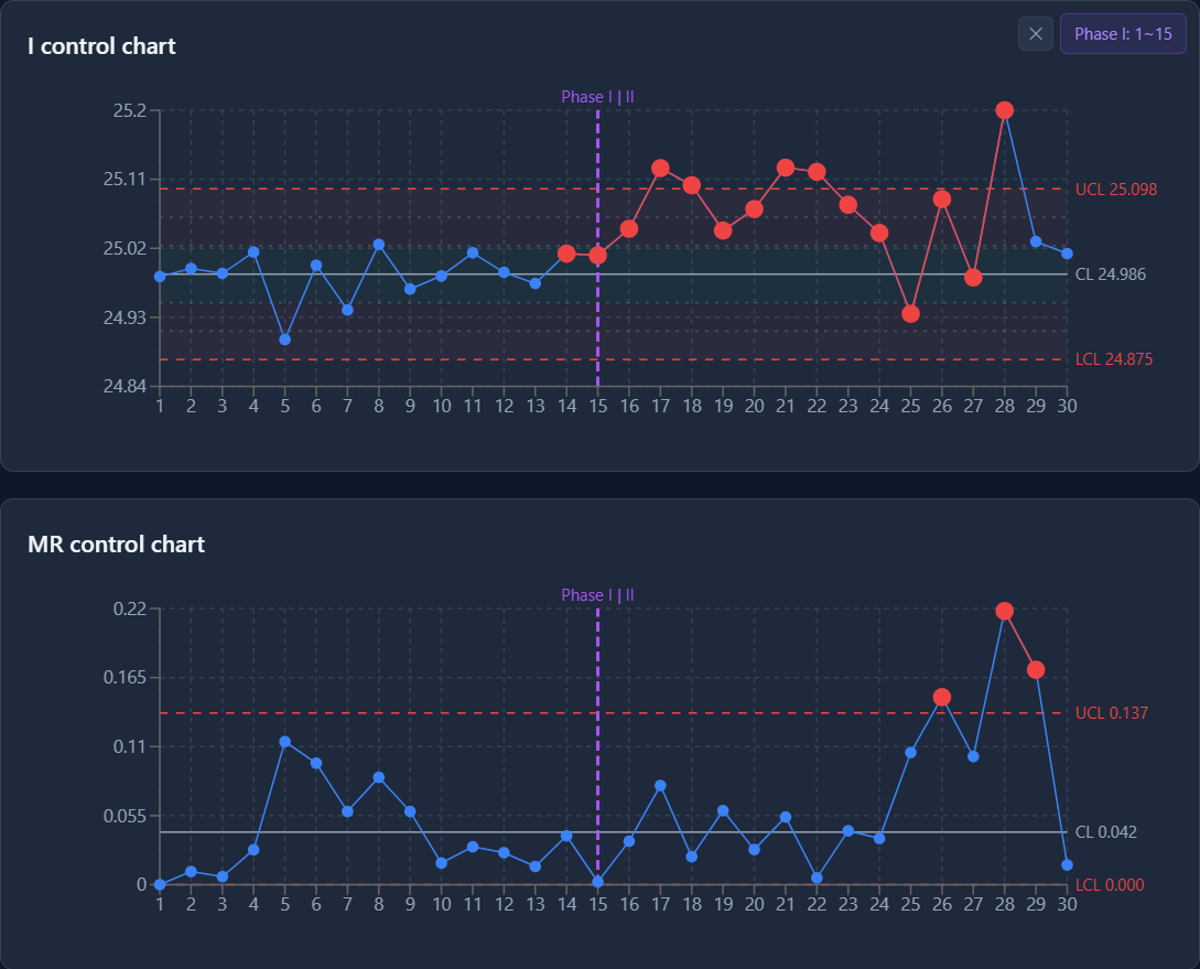
| All 30 shots | Phase I = 1–15 | |
|---|---|---|
| I chart UCL / CL / LCL | 25.183 / 25.026 / 24.869 | 25.098 / 24.986 / 24.875 |
| MR chart UCL / CL | 0.193 / 0.059 | 0.137 / 0.042 |
The limits are now UCL = CL + 2.660 · MR̄ and UCL(MR) = 3.267 · MR̄ from the baseline alone. Against them the picture changes completely:
- Shots 17, 18, 21 and 22 are beyond the upper limit. The shift that was invisible in step 2 is now the plainest thing on the chart.
- Shot 28 is still beyond it.
Step 4 — Read the signals, on both charts
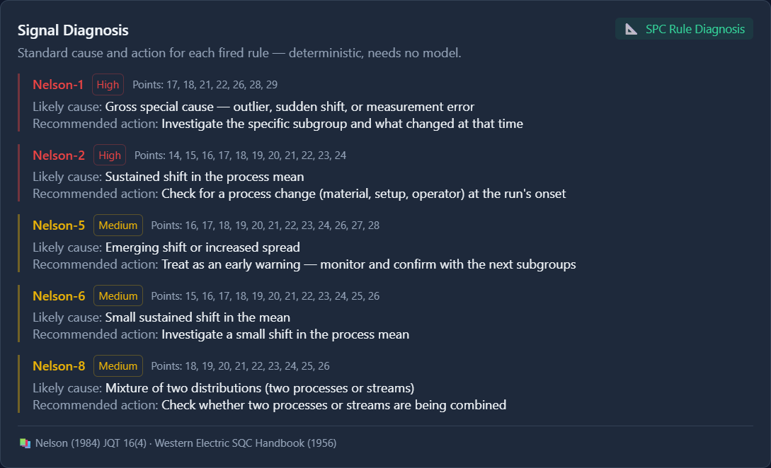
The Signal Diagnosis card groups the signals by rule. Its point lists combine the I and MR charts; the OOC Signals list below it names the chart for each one. For this project:
| Rule | I chart | MR chart |
|---|---|---|
| Nelson 1 — a point beyond 3σ | 17, 18, 21, 22, 28 | 26, 28, 29 |
| Nelson 2 — 9 in a row on one side | 14–24 | |
| Nelson 5 — 2 of 3 beyond 2σ, same side | 16–24, 26–28 | |
| Nelson 6 — 4 of 5 beyond 1σ, same side | 15–26 | |
| Nelson 8 — 8 in a row beyond 1σ, either side | 18–26 |
Three things to read out of it:
- One heavy part shows up twice on the MR chart. A moving range compares a point with the one before it, so the outlier at shot 28 inflates both MR₂₈ (0.218) and MR₂₉ (0.171). On an I-MR chart, a pair of high moving ranges next to a single I-chart outlier is usually one event, not two.
- MR₂₆ (0.149) is the jump from 24.93 g at shot 25 to 25.08 g at shot 26, while the process was still settling after the shift.
- Rule 8 reads as "a mixture of two distributions" — which is exactly what the data is: a process running at two different levels.
The count of OOC Signals rises from 26 to 52. It counts rule violations, not points, and the baseline has made more of the shift visible to more rules.
Step 5 — Compare Cp/Cpk with Pp/Ppk
With the baseline set:
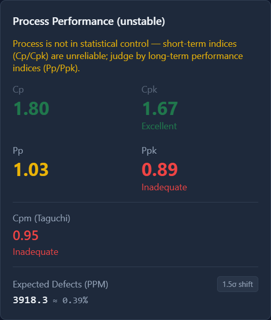
- Cp 1.80, Cpk 1.67 use the short-term spread of the stable period (σ̂ = MR̄ / 1.128 = 0.0371 g). The app grades Cpk Excellent — and dims it, because the process is not in control.
- Pp 1.03, Ppk 0.89 use the overall standard deviation of all 30 parts (0.065 g), shift and outlier included. Ppk is graded Inadequate.
Both are correct; they answer different questions. Cp and Cpk describe what the molding process is capable of when nothing changes. Pp and Ppk describe what it delivered over these 30 shots. The gap between 1.67 and 0.89 is the cost of the special causes — and it is the argument for removing them rather than for tightening the tolerance or accepting the process.
Without the baseline (step 2), Cpk was 1.11: the contaminated spread made the short-term capability look worse than it is and the stability problem look smaller than it is.
The Anderson-Darling test gives A² = 0.5115, p = 0.1955, so the normal-distribution reading of these indices is reasonable.
Step 6 — See the two spreads side by side
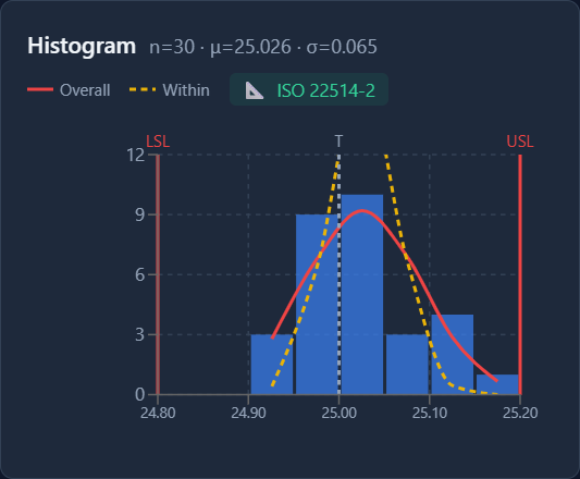
The histogram overlays both fitted normal curves between LSL and USL:
- Overall (solid) — the spread of the data as it came out, which reaches toward the USL.
- Within (dashed) — the short-term spread, much narrower. Its peak is taller than the bars, so it is cut off at the top to keep the bars readable.
If the shift were removed, the parts would follow something like the dashed curve.
What to take away
- With individual measurements, a shift inside the data widens the limits enough to hide itself. A Rule 2 run that covers most of the chart on both sides of the center line is a hint that the center line sits between two process levels.
- Set Phase I from your records of when the process was known to be stable, then judge the rest against it.
- On the MR chart, one outlier produces two high moving ranges.
- A high Cpk next to a low Ppk means the process is capable but not stable — fix the special causes.
References
- Montgomery, D. C. Introduction to Statistical Quality Control, 8th ed. Wiley, 2019, §6.4.
- ISO 7870-2:2023 (Shewhart control charts).
- AIAG. Statistical Process Control (SPC) Reference Manual, 2nd ed., 2005.
- Nelson, L. S. Journal of Quality Technology 16(4), 1984, pp. 237–239.
- Anderson, T. W., and Darling, D. A. Journal of the American Statistical Association 49(268), 1954.